How To Build A Material Palette
A practical editorial pattern for explaining stone, wood, textiles, metal, and paint as one system.
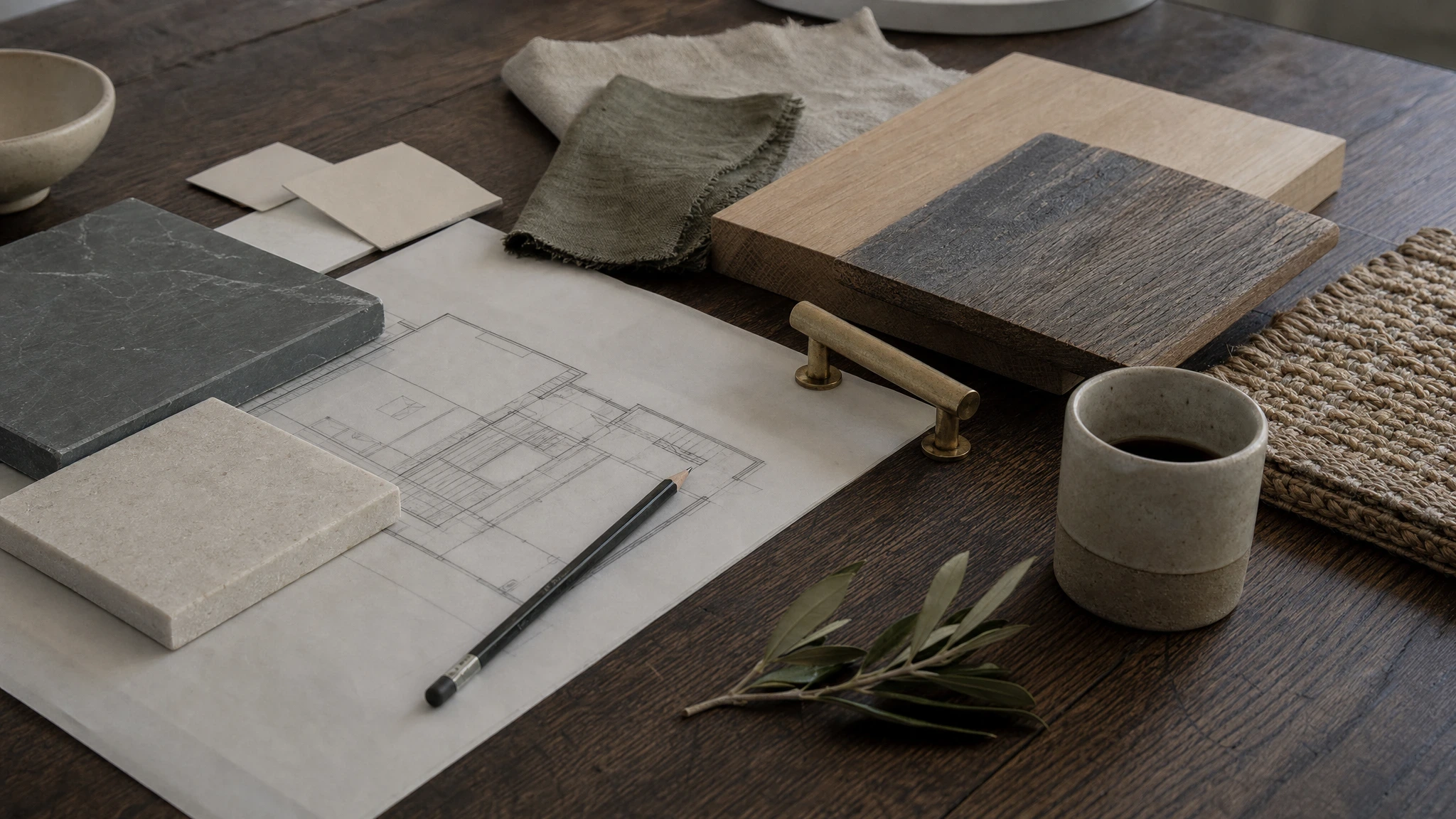
A material palette is a set of rules for the whole house. It should tell the team what repeats, what gets to stand apart, and which beautiful options do not belong.
Begin with fixed surfaces
Start with the materials that will be expensive or messy to change later: flooring, stone, tile, plaster, cabinetry, metal finish, and exterior door or window color. These decisions set the temperature of the rooms before furniture enters.
Do not begin with pillows, art, or a single favorite chair. Those layers can flex. Floors and counters cannot. If the fixed surfaces are too warm, every later object has to cool the house down. If they are too gray, furniture will spend the next decade trying to give the rooms a pulse.
Build a narrow language
A strong palette has fewer materials than most people expect. One wood direction. One primary stone language. One family of whites or plasters. One main metal. One secondary texture for softness.
The point is not austerity. The point is memory. When oak repeats from floor to cabinet detail, the house starts to feel intentional. When every bath uses a different stone, every room has to introduce itself again.
Write the allowed range for each material. "Warm white plaster, no yellow undertone" is more useful than "soft neutral walls." "Brushed nickel in working rooms, aged brass in public rooms" gives the team a rule that can survive procurement.
Let one material carry warmth
Warmth gets muddy when every surface tries to provide it. Pick the material responsible for warmth and let the others support it. Oak floors may carry the warmth, while stone, paint, and metal stay quieter. A clay tile may do the work in a bath, with painted millwork and simple hardware stepping back.
This is especially important in coastal or bright rooms. Sun can turn cream paint yellow and brass louder than expected. If the room already has warm light, the palette may need cooler stone or a cleaner wall finish.
Lay samples together in daylight and at night. A palette that works only under studio lamps has not been tested.
Test samples in real light
Move samples through morning, afternoon, and evening. Put them where they will live: stone flat on the counter plane, paint upright on the wall, metal beside the faucet or pull it will meet, fabric near the window.
Look for undertones that appear only beside other materials. A white can go green next to one stone and pink next to another. A timber sample can look calm beside plaster and orange beside brass. A gray textile can turn blue when it sits against a warm floor.
Photograph the samples, but do not decide from the photograph. The camera edits too much.
Decide where contrast belongs
Contrast should have a job. A dark metal can sharpen a pale kitchen. A stone threshold can mark a room change. A deeper paint can make a small library feel held. If contrast appears everywhere, it stops helping.
Choose two or three places where the house is allowed to change register. Keep the rest of the palette steady. The result feels calmer because the eye understands where to pay attention.
Write the rules before purchasing
The palette should answer future questions without a meeting. Which whites are allowed? Which metals repeat? Which woods are off-limits? Where is stone allowed to be active? Which rooms can take pattern? Which rooms need to stay plain?
Good rules protect the project from slow drift. They also make substitution easier. When a tile goes out of stock, the team can choose a replacement by matching the rule, not by guessing what everyone liked two months earlier.